I strongly believe, therefore, that the choice of colour within my logo and brand packaging design is highly important when conveying brand image and values to the target customer, as this theory suggests a natural psychological reaction between consumers.
Colour
Zyman (2001) as cited in (communicating fashion brand personality with colour) states that the use of colour is frequently applied to set the mood of a brand through brand logos.Hynes (2008)
A study completed by Hynes (2008) identified three different schools of thought which is a result of the choice in colours used on a logo.- Chromodynamics: the 'temperature' of colour and the physiological effects colour has on a consumer. There are two types of colour segmentation groups, 'warm colours' and 'cold colours'.
- Red: believed to raise blood pressure
- Blue: reduces blood pressure
- Warm colours have long wavelengths, which help to stimulate you. For example, red, yellow and orange which can evoke feelings of anger and excitement.
- Cold colours compromise of short wavelengths such as green, purple and blue which can evoke feelings of peacefulness and restfulness.
Claudia Cortes
Claudia Cortes's study on the feelings created by certain colours has acted as a useful tool when deciding on how to develop Mavo's brand packaging and logo.
- Yellow: Creative, young, visible, bright, cheerful, light-weight, curious, coward, playful, nutritious, ill, expanding
- Red: dynamic, vital, romantic, commanding, alert, rebellious, complementary, joyful, visible fun
- Orange: helpful, burning, cosy, abundant, warning, flavourful, festive, active, excited, communicative, inspiring
- Blue: technical, deep, free, educated, protective, lonely, peaceful, cold, clean, authoritative, formal
- Green: patient, natural, adventurous, relaxed, athletic, unfortunate, lucky, balanced, safe, sharing
- Purple: intelligent, artistic, aloof, luxurious, royal, vain, fantastic, melancholic, feminine, fragrant, solemn
To conclude, the brand packaging and logo will use a purple shade - however, trying to avoid using the same purple as Cadbury's and the Premier Inn.
Below is a table of purple swatches which will assist in the decision of brand colour:

The colour which will be used for the Mavo logo is S098.
Logo Design
I have decided to use a simple and basic font, without 'tweaking' it in Adobe Illustrator. The fonts I have been experimenting with are all similar but with slight differences.


Font: Hype

Font: Libby


Font: Europe Underground

Font: Veron
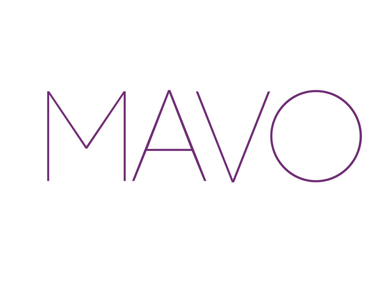
Font: Code
All of the fonts used do have a lot of similarities, however, there are very slight differences contrasting each logo.
There are two logos which I like most, and they are
- The last logo design (font: code)
- The third from top logo design (font: Europe Underground)
I have conducted a 1 question survey which asks those which logo they prefer for a hotel. The results are as follows:
- 113 respondents.
| Total (% & freq col) 100.00% (113) | ||
| Europe Underground | 23.01% | 26 |
| Code | 76.99% | 87 |
Choice with age
| Total (% & freq col) 100.00% (113) | Male 100.00% (29) | Female 100.00% (84) | ||||
| Europe Underground | 23.01% | 26 | 37.93% | 11 | 17.86% | 15 |
| Code | 76.99% | 87 | 62.07% | 18 | 82.14% | 69 |
Brand Packaging
I like the idea of using fashion photography within my brand packaging stationary. The mock up photographs have been taken from Vogue, and re-mastered by using a simple font "Bebas Neu" to incorporate visuals with minimalism.
Receipt holder
The receipt holder will be shiny gloss card which will have an image like the two below with the simplistic writing. On the back it will be plain, and inside will have the thin paper receipt.


Membership Card
The front of the membership card will be a personally chosen photograph of the member (example below) and then the back of the card is the following design.

Membership Card, front

Membership Card, back
Business Card
Business Card, side 1

In keeping consistency with the designs of the receipt holders and other packaging, 'one side' will be like this and the other with the Mavo logo and address.
Business Card, side 2


No comments:
Post a Comment