Research has shown, by different theorists and researchers, that there are various elements which make a hotel's website good. Below are three different beliefs and theories:
Bevan (2001) Huizingh (2000) Neilson (2003) Palmer (2002) as cited in Law and Bai's "How Do The Preferences Of Online Buyers And Browsers Differ On The Design And Content Of Travel Websites?" (2008) believe that website evaluations are measured by two major deciding factors. Firstly, the content richness and secondly, the website's ease of use.
World's Best Enterprises (2004) however, believes that the design and content of a website largely contributes to its success.
Cheung and Law (2003) as well as Liang and Law (2003) state that the functionality of a hotel's website can be segmented into 5 different categories:
- Facilities information
- Customer information
- Reservation information
- Surrounding area information
- Management of website
Personally, I agree with all of these theories, however the latter theory is more applicable and relevant to the consideration of my hotel website design.
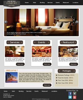
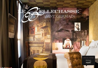
Below are examples of hotel website homepage layouts which have all been taken from Pinterest:
Via Pinterest
Via Pinterest
Via Pinterest
Via Pinterest
Via Pinterest
Via Pinterest
Via Pinterest
Via Pinterest
Via Pinterest
Via Pinterest
Via Pinterest
Via Pinterest
Via Pinterest
Via Pinterest
Via Pinterest
Via Pinterest
Via Pinterest
Via Pinterest
Via Pinterest
Via Pinterest
Via Pinterest
Via Pinterest
Via Pinterest
Via Pinterest
Via Pinterest
Via Pinterest
Via Pinterest
Via Pinterest
Via Pinterest
Via Pinterest
Via Pinterest
Via Pinterest
Via Pinterest
Via Pinterest
Via Pinterest
Via Pinterest
Via Pinterest
If the website for Mavo looks slick, presentable and fashionable then it would ultimately make the customer carry on reading - which will then take them to the most important pieces of information.
The website will use various visual aids, but not in an over-used sense which would make it look tacky and inferior to competitors. For example, the last website template which you see uses various visual aids at once to potentially help encourage the ideas of the customer - but in a chic and simple looking way.


No comments:
Post a Comment